A progression tracker for COVID-19.
As The 2019 novel coronavirus (2019-nCOV) has taken the world’s mainstage as a global pandemic, we demonstrate several open-source, rapidly-developed mapping tools that can be used to analyze case count and testing information for 2019-nCOV since its inception in the US.
The case count data is gathered from 1Point3Acres, which pulls data from ‘...data crawlers, API calls, and user submissions.’ The testing data is downloaded from The Covid Tracking Project, a similar volunteer initiative that combines tools and user submissions to provide counts of completed tests.
We gathered and processed data from 1Point3Acres, The COVID Tracking Project, and 5-year estimates from the 2018 American Community Survey (ACS) to provide population-standardized, longitudinal information that form the basis of our visualizations.
Each point represents a county that has reported positive Covid-19 cases. Three layers are created every six hours based on the latest data, including all counties with positive cases, top ten counties with highest mortality rate and highest number of increase (all visualized via proportional symbol). Users can choose to hide specific layer(s) by clicking on the legend item. Based on data for each day, a timeline is generated to show the spatiotemporal evolution of Covid-10 outbreak in US counties.
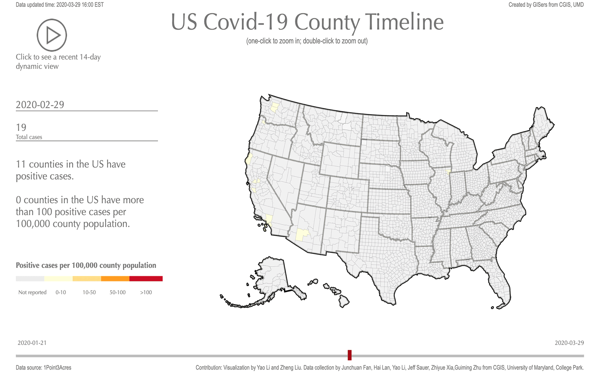
This choropleth map uses population adjusted positive case number to highlight the "hot-spot" regions for Covid-19 of US in county level. Tooltip box was used to show the raw countd of positive cases and its adjusted value. Users can use slidebar to see how the situation changes over time or can use the play button to show the latest 14-day timeline dynamics.
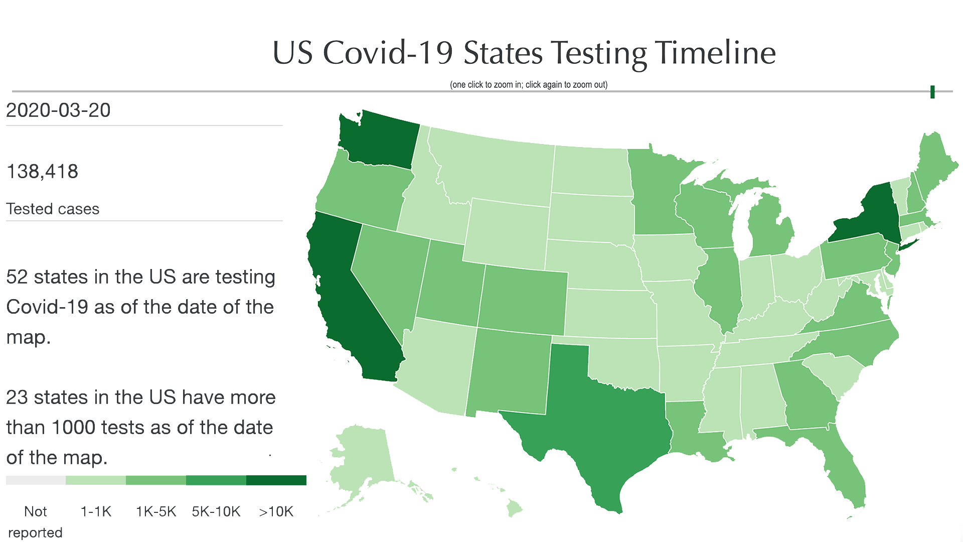
We used D3 to visualize the testing of Covid-19 in each state of United States since March 4, 2020. Tooltip box was included in the map to show the number of positive, negative, pending and also the positive ratio (positive cases/total testing cases)
A list of tools used by this project
A powerful, interactive charting and visualization library for browser.
JavaScript API for rendering interactive 2D and 3D graphics within any compatible web browser without the use of plug-ins.
A JavaScript library for producing dynamic, interactive data visualizations in web browsers
An open source mapping platform for custom designed maps